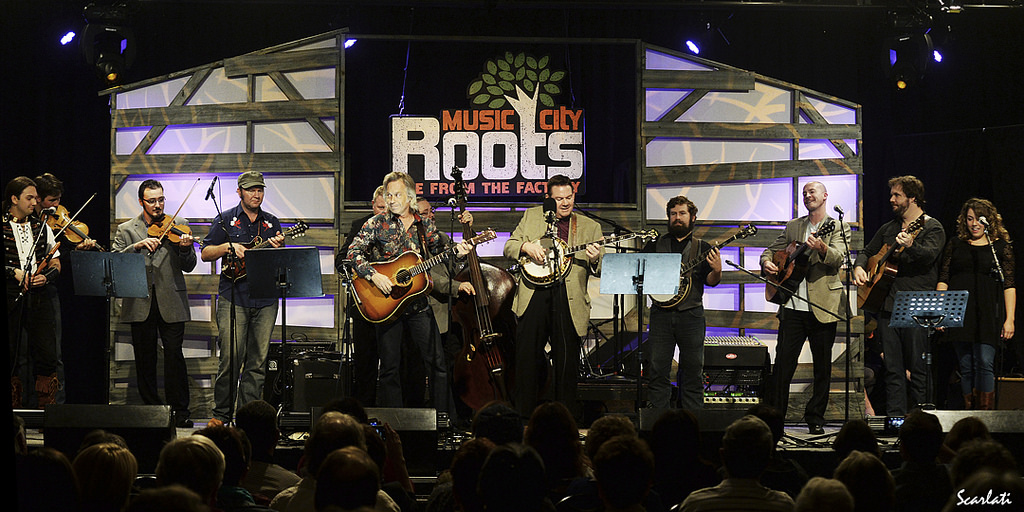
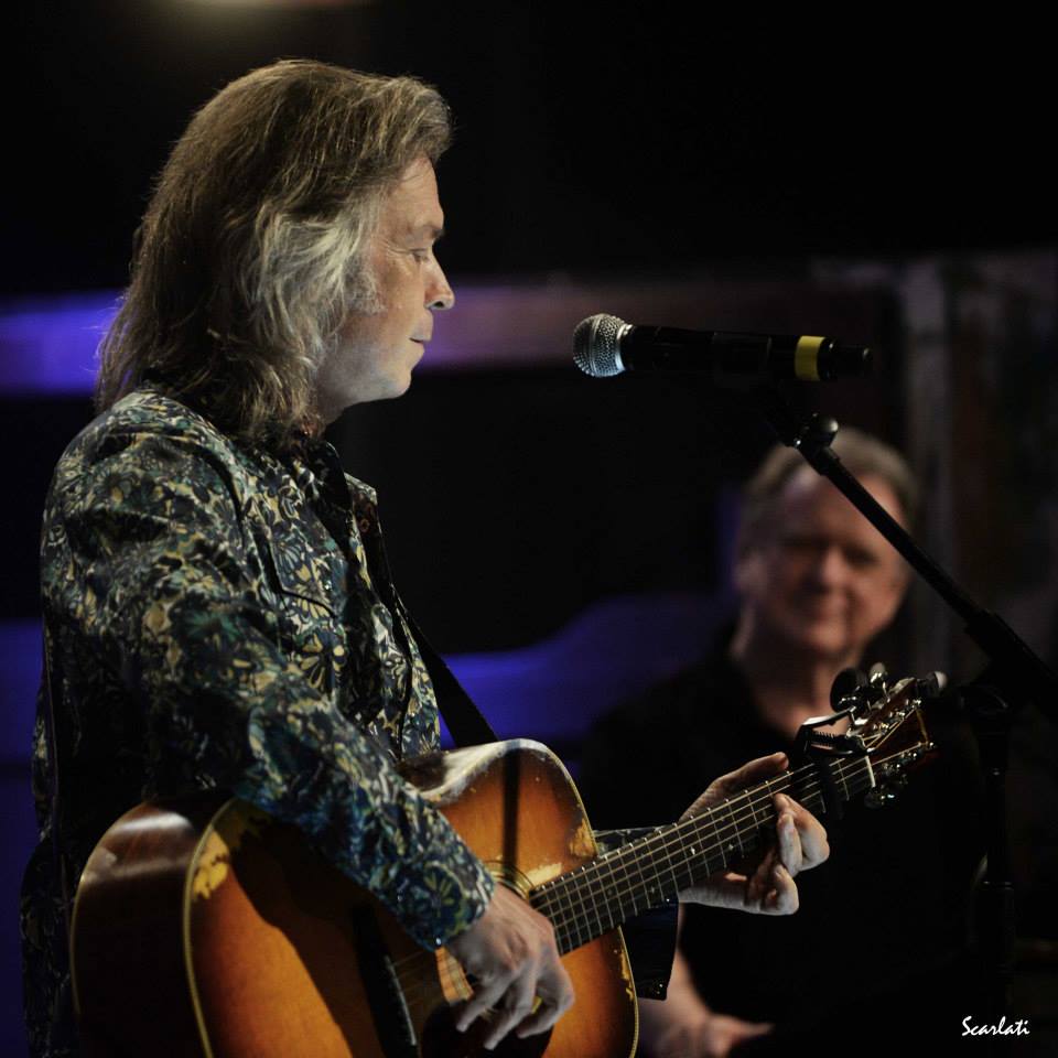
Photograph by Anthony Scarlati
For the first show of Music City Roots’ Fall season, host Jim Lauderdale showed off both a new bluegrass song and a new Dandy & Rose shirt.
The song, a sprightly number, is called Don’t Count Me Out and he opened the show with it – the video is here:
http://new.livestream.com/MusicCityRoots/live/videos/64354366


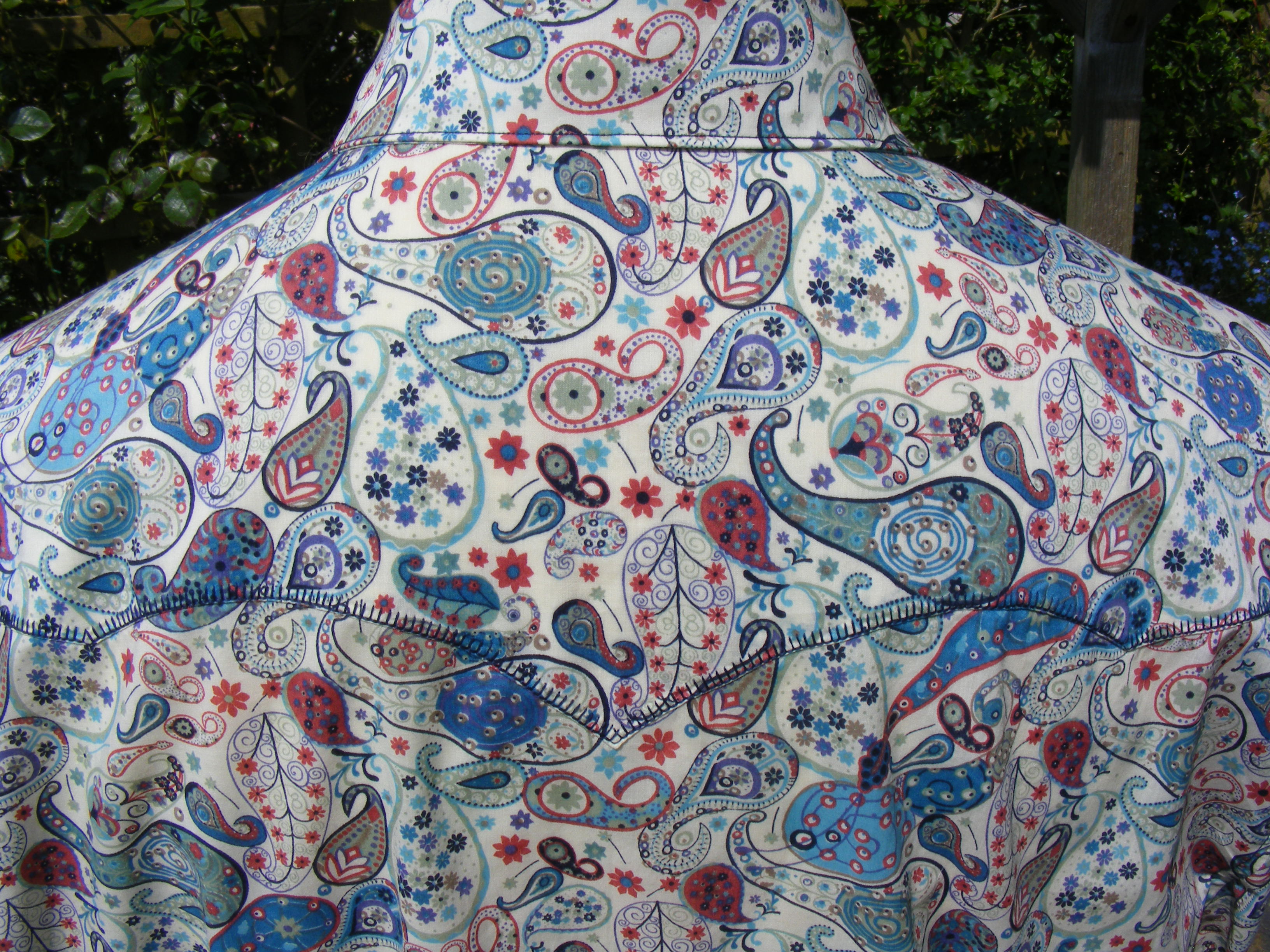
The print is new too, from Liberty’s Autumn/Winter 2014 range. It’s called ‘Midnight’.
It’s one of my favourites ever, with its dazzling details and darkly beautiful colouring. I finished the shirt with a fancy stitch and sneaked in a burgundy collar stand – we all need a little warmth next to our face at this time of year!
Liberty say that the design was ‘hand drawn in ink on tracing paper’ then shaded with graphic pens; it was inspired by the night sky over the Isle of Bute in Scotland – hence the twinkling, exploding, shooting stars in amongst the paisleys.


There are four colourways. Liberty printed them on denim as well as on the tana lawn that I used for Jim’s shirt. A few days ago I was in Liberty’s Regent Street store and couldn’t resist buying a metre of denim in that hot orange and pink colourway – I plan to make myself a skirt as soon as I’ve got a couple of hours to spare!


 https://dandyandrose.com/2014/03/14/danny-champs-shirts/