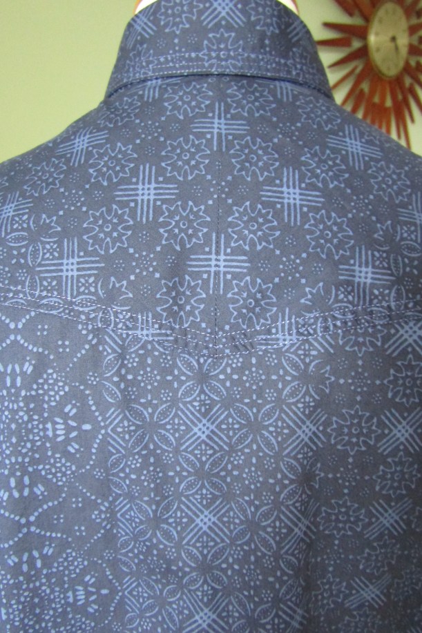
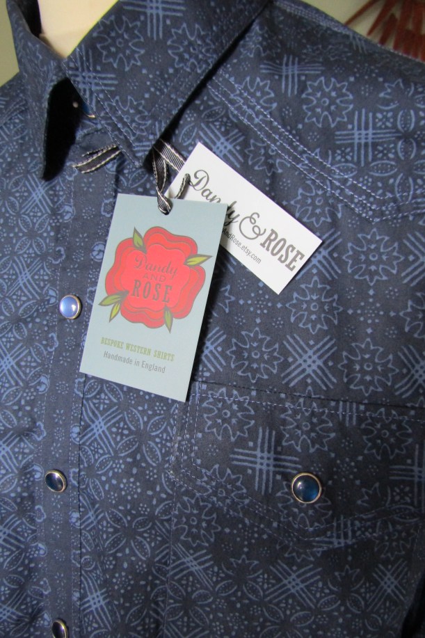
With its delicate old fashioned blooms, this shirt lives up to the Dandy & Rose name.
This is a deceptively simple print – there are several shades of orange and peach blending in those roses and the stems and leaves are a gentle olive green. I have loved working with it and giving it those orange accents.
Bill DeMain is a very talented man. He is a journalist who has interviewed all your musical heroes; an accomplished musician and songwriter based in Nashville; the entertaining and astoundingly knowledgeable tour leader of Walkin’ Nashville; and a recently converted Francophile.
Bill visited Paris last year and fell in love with the city. During March, he returned for one of those total immersion language courses and kept his instagram followers entranced with photographs of the things he saw (and ate) while in The City of Light.
When Bill asked me for suggestions for his third Dandy & Rose shirt, this wonderful Arts and Crafts style print by Liberty leapt right into my mind. It seemed like such a fun way to acknowledge Bill’s love of France. And just look at that frog, with his little toes!
It can get hot out there, walkin’ Nashville, so Bill likes short sleeves. I like short sleeves too, and leap at the opportunity to make them.
I have been waiting for an opportunity to use this print ever since it came out last year. I’m so glad that one has has hopped along.
OK. That’s enough corny frog jokes. Unless you know any.
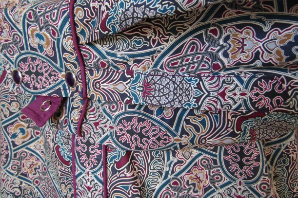
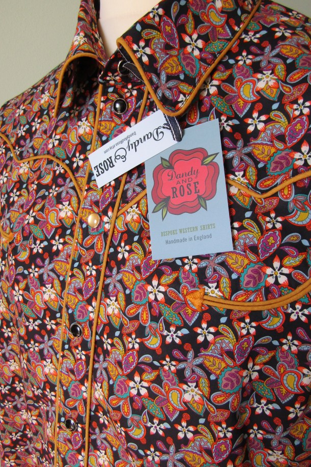
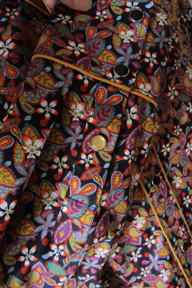
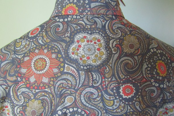
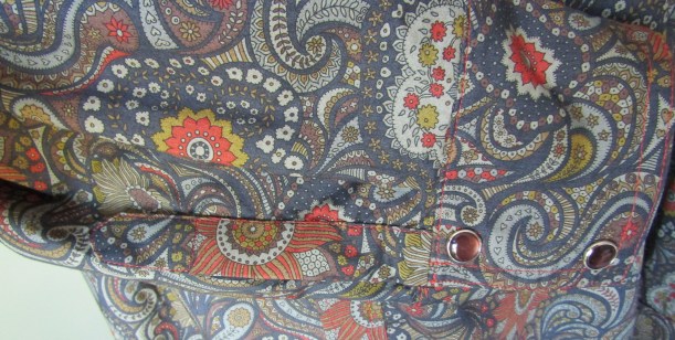
What a great fabric choice my new Californian customer, Joe, has made! This print is from the current Liberty of London range. It completely removes the need to make a decision that many of my customers struggle with: floral or paisley? It has them both!
Joe opted for lots of piping and ‘smile’ pockets.
I have placed one of my signature contrast pearl snaps in line with the yoke….
… and added an extra yellow snap to each sleeve placket. It just seemed like the right thing to do.
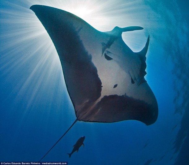
This is the third shirt this customer has ordered. He found me through my online shop about a year and a half ago and by the time he got in touch, he had already chosen the print he wanted from Liberty‘s online offering. He likes to keep his prints simple, so he chooses the quiet designs. I love that, because I would otherwise overlook them, and they turn out to be brilliant. His first choice was this Jackson Pollock style spatter print:
On the day he received this shirt, he ordered the next. Now that’s what I call customer satisfaction! Although it was a bold and sunny yellow, it had fewer colours than most of the prints I work with.
This new one is intriguing. It’s called ‘Mantaray’ – you will see that the design takes the graceful shape of the fish of the same name.
I did a lot of thinking before I cut into this fabric!
‘Agandca’ is one of the most intriguing Liberty prints I have worked with. It is based on a 1910 design from the Liberty archive and the complicated pattern looks a bit like embroidery. It’s arranged in wide stripes – but unlike your average stripe, they are asymmetrical.
Cue shirtmaker headache.
I decided to use the stripe by cutting the yokes and pocket flaps ‘on the bias’ – I explained what that means last time I used the technique here
The three strokes in that cross motif in the design inspired me to finish the shirt with a triple line of topstitching.
Thor Platter has a new album coming out in October, which I can’t wait to hear. He asked me to source a Liberty print with a retro look, in dusky browns, greens and oranges, to chime in with the artwork for the record sleeve.
It took about a week, but finally I remembered filing this one away at the back of my brain.
This year has been such a busy one for research, writing and shirtmaking that I have got rather behind with this blog.
So here are all the shirts I have made so far and not blogged about:
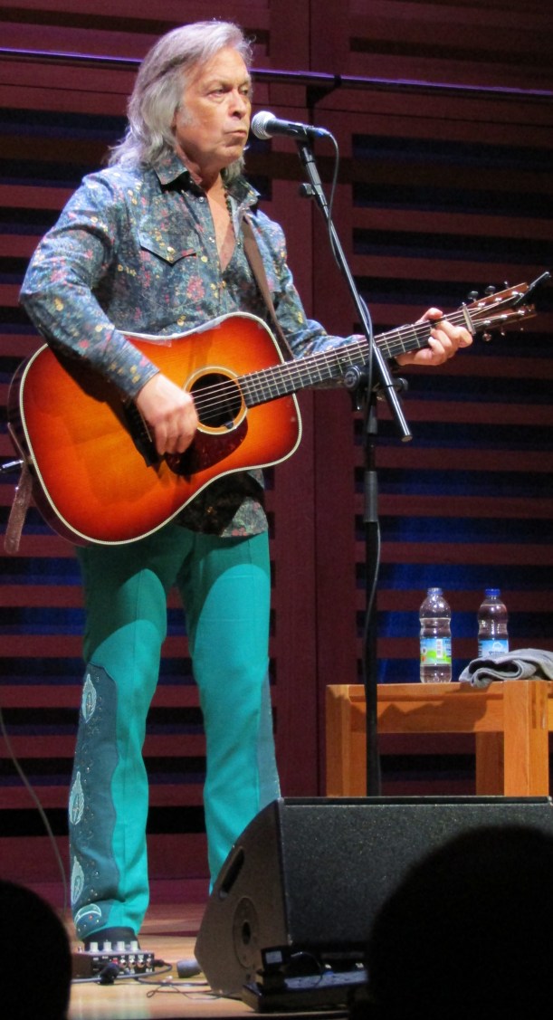
First up a marvel of symmetry in Liberty’s William Morris-designed print ‘Lodden’. It belongs to Thor Platter, a singer songwriter who tracked me down at last year’s Americana Music Association Festival in Nashville. I’m very glad he did!
Thor Platter’s shirt in Liberty’s ‘Lodden’
Thor Platter’s shirt in Liberty’s ‘Lodden’
Then in February, I came across some of one of my favourite out-of-print Liberty designs, a psychedelic paisley called ‘Forty’. So I snapped some up and made two shirts: a black one with red piping for redoubtable Americana tour manager, Andy Washington; and an all-over print for Jim Lauderdale.
Andy’s shirt in psychedelic paisley Liberty print
Jim Lauderdale’s shirt in psychedelic paisley Liberty print
I’ve been thinking a lot about Sixties men’s fashion recently and just for fun I made this ruffled shirt in another psychedelic Liberty print that has been a favourite:
A few months later, I was commissioned to make another shirt in the same fabric, this time in a western style:
Mark’s shirt in Liberty’s psychedelic Liberty floral print
Mark’s shirt in Liberty’s psychedelic Liberty floral print
As summer arrived, I made a couple of short sleeved shirts. The first was for a young man looking for something special for his birthday party. He chose the classic Liberty peacock feather design, ‘Hera’ and went for a non-western style.
Guy’s shirt in Liberty’s ‘Hera’
Guy’s shirt in Liberty’s ‘Hera’
The second was made from vintage fabric that I bought from a lady who inherited it from her mum. There was quite a collection and it was hard to choose, but this was one of my favourites:
Jim Lauderdale’s shirt in vintage floral Liberty print
Jim Lauderdale’s shirt in vintage floral Liberty print
Finally, this shirt in a sweet, fresh Liberty floral was commissioned as a gift from a husband to a wife. I love being part of that!
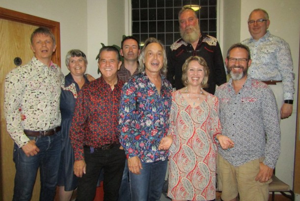
Dandy & Rose’s biggest champion, the Grammy-winning singer songwriter Jim Lauderdale, toured the UK during July and excitingly, he played in Lewes, the hometown of Dandy & Rose!
Jamie Freeman of Union Music Store, who is also a singer songwriter, suggested that after the show, we might be able to set a world record for the most Dandy & Rose shirts worn in the same place at the same time. And we did!
Left – right (back row) Jamie Freeman, Stevie Freeman, Alasdair Mackay, Andy Washington, Michael Hingston (front row) Jeff Tickle, Jim Lauderdale, me (Janet Aspley), David whose second name I don’t know!
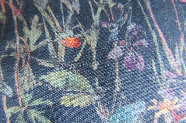
It seemed wrong that Jim didn’t have a new shirt for his tour, so the following week we picked out a print from Liberty’s current range called ‘Wild Flowers’. It was designed by the paper cutting artist Su Blackwell, who says it reflects her childhood experience of wandering the countryside, discovering native flora. Su’s work is stunning and you can see more of it here: sublackwell.co.uk
Just as I was giving the shirt a final press before dashing up to London to deliver it to Jim before his London show (which was great!), I noticed the word ‘Strawberry’ hidden amongst the stalks and leaves in the design.
How wonderful to work with designs that are so detailed and exquisite that there is still something to discover in them when you have been looking at and handling them for many hours!
Jim Lauderdale’s shirt in floral Liberty print
Jim Lauderdale’s shirt in Liberty’s ‘Wild Flower’ print
Jim teamed his new shirt with a pair of sparkly, embroidered trousers by Manuel. The combination was marvellous!
Jim Lauderdale in his Dandy & Rose shirt in Liberty’s ‘Wild Flowers’ print, onstage at King’s Place, London, July 27th 2017
One thing I love about working with Liberty prints is the complexity and depth of their designs.
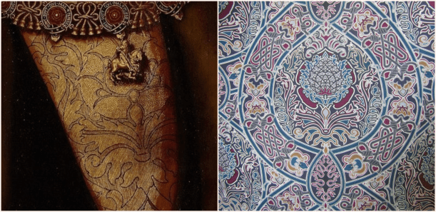
This one, Gambier, is from their 2015 A/W range and I loved it so much that I bought a length ‘on spec’, hoping that someone would fall for it as much as I did. A couple of customers did, and they both commented that it looked Celtic. I agreed – that’s a thistle in the middle of the design, isn’t it? And look at that knot! Celtic, if ever I saw a knot!
I had a vague memory, though, that Liberty had said the design had Tudor connections. Now, I have had a fascination with Tudor history since I can’t remember when. Then, a few years ago, I started dressing as a Tudor in out annual torchlit November 5th procession here in Lewes and now I find that, when I am not thinking, reading about and making western wear, I am thinking and reading about Tudor dress. And making it. O, and wearing it, too. But only on November 5th.
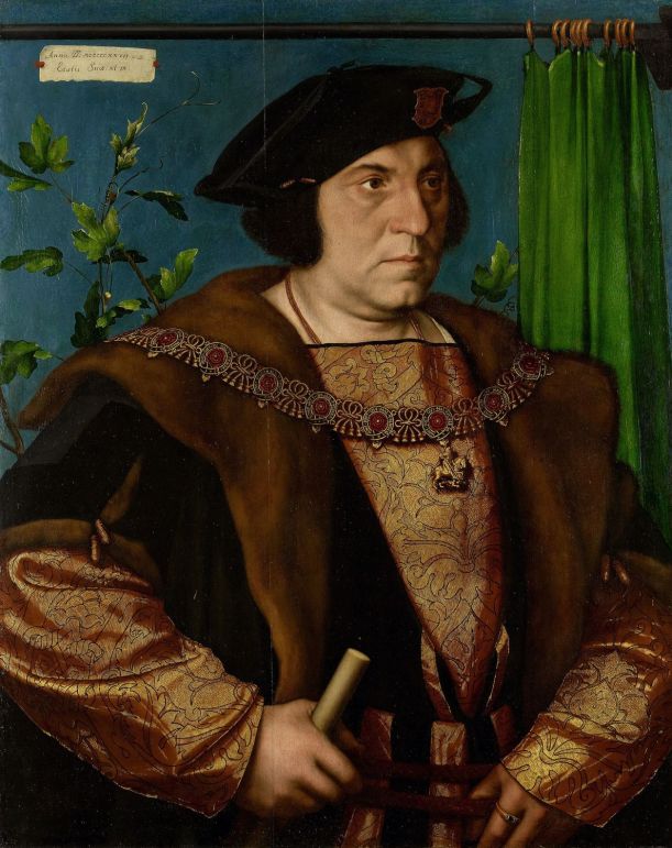
So when I checked back on Liberty’s website and learned that this design was based around textiles in the paintings of Henry VIII’s court painter, Hans Holbein (1497/8 – 1543), I was intrigued. The dress history geek in me just had to go hunting.
I love Holbein. I went to an exhibition of his drawings of Henry’s courtiers at the Tate Gallery a few years ago and looking at them, I felt they could have been standing alive in front of me. Even the mightiest were made humble by his humanising strokes.
Here’s poor Anne Boleyn in her nightie.
It was Holbein who created the image of Henry VIII, in all his bulky, murderous masculinity, that we still hold as iconic . So that’s where I looked for the motifs that inspired the designer of our Liberty print. It turns out that the central motif is not a thistle but a pomegranate, a symbol in Tudor times of fertility and abundance. In 1540, when Holbein painted this portrait of Henry, he wore a coat made from fabric decorated with a stylised pomegranate design, so we would all know what a fertile and abundant man he was.
But I think the actual inspiration for it must have been a portrait of one of Henry’s close friends, Sir Henry Guildford (1489 – 1532). Sir Henry was at one point the King’s ‘Master of Revels’ responsible for organising the court’s entertainments. But by the time this portrait was painted in 1527, he had the responsible role of Comptroller of the King’s Household. He looks as if he was a force to reckoned with, doesn’t he?
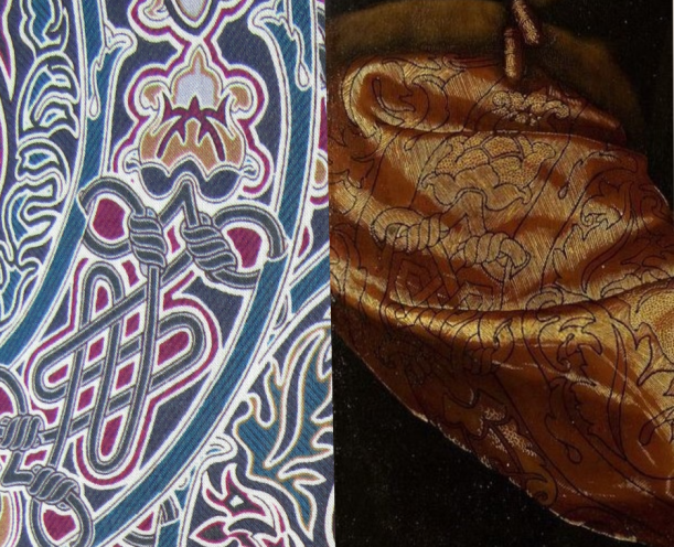
Holbein has used gold leaf to show us how sumptuous his robe is – and look at that chain!And look closely at the pattern on that gold cloth… here’s our pomegranate:
And here’s our knot:
So… not Celtic, after all. It turns out continuous knots occur in the art of many cultures – Islamic, Buddhist and at the court of that most English of Kings, Henry VIII.
I guess there must have been continuous knots all over these islands, in the same way that there were versions of the same familiar folk songs from England, Scotland and Ireland.
Does that design still look Celtic to you? It still does to me! But that’s alright, I think. Like a great song, a beautiful design can cross cultures and have more than one meaning, depending on what angle you see it from, or how your ear is cocked. That’s all part of our richness, and what makes human culture so life enhancing.


 How wonderful to work with designs that are so detailed and exquisite that there is still something to discover in them when you have been looking at and handling them for many hours!